
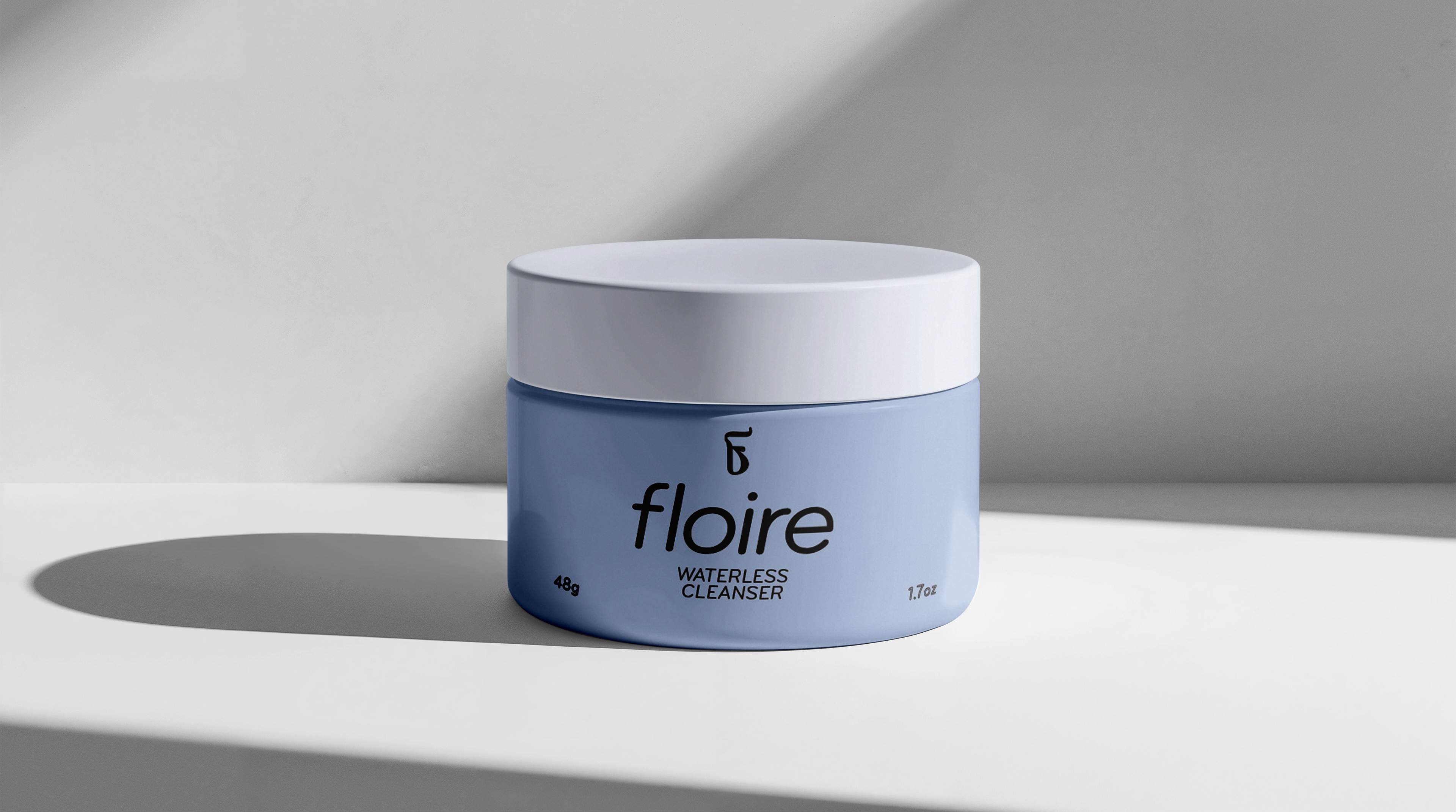
This project features packaging and marketing for Floire Skincare, a fictional waterless skincare brand focused on eco-conscious formulas and sustainable packaging. Inspired by values like purity, ethics, and environmental awareness, I developed a clean, modern identity using soft, flowing forms and a gentle colour palette of dark brown and light blue to reflect groundedness and clarity.
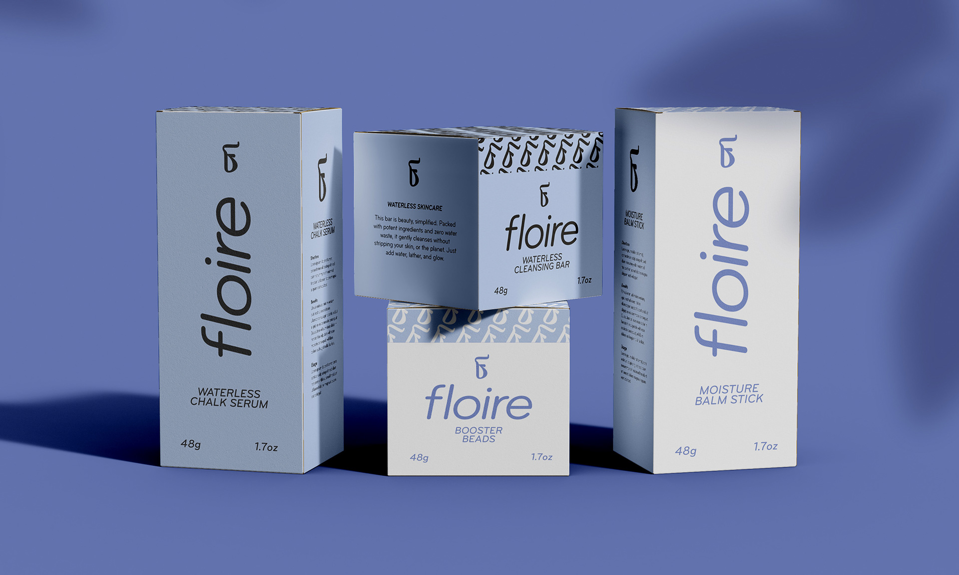
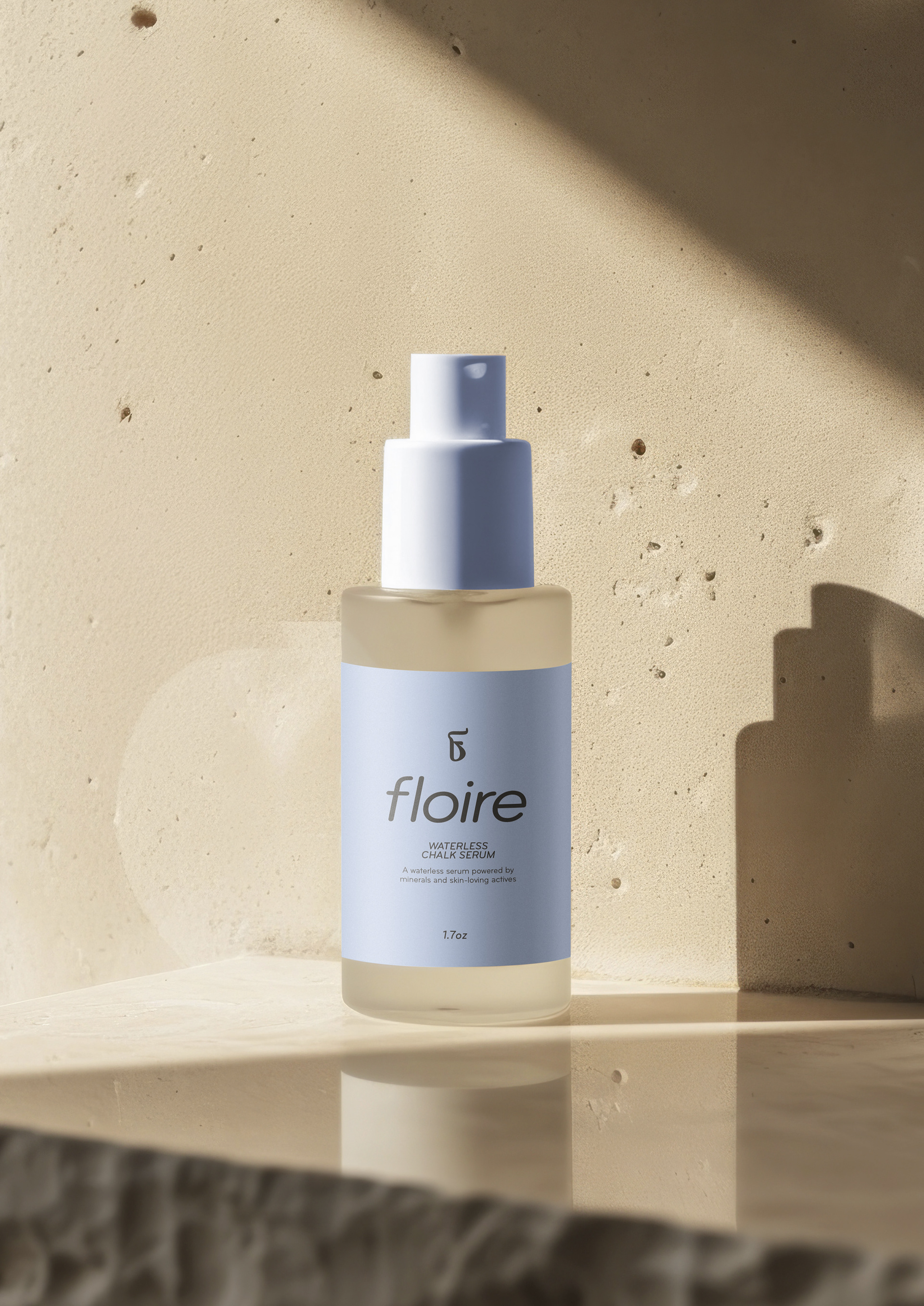
Working with a limited palette and soft design language helped maintain a cohesive visual identity that reflected Floire’s core values. The minimal colour scheme emphasized purity and simplicity, while the flowing forms echoed the fluid, gentle nature of skincare despite being waterless. These choices supported a brand experience that feels both refined and environmentally responsible. This project gave me the opportunity to explore how sustainability can influence every design decision, from materials and colour to layout and tone. It challenged me to think critically about how to visually communicate values like transparency, care, and conscious consumption in a way that feels modern, engaging, and meaningful.
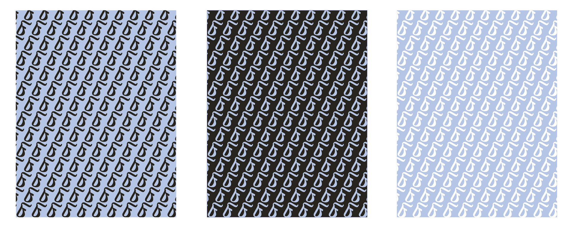
I used Adobe Illustrator to create vector assets such as the logo and icons, and Photoshop for mockups and 3D visuals. The final portfolio includes packaging prototypes, flats, and brand elements that together form a cohesive, approachable brand experience.
Creating Floire Skincare challenged me to think deeply about how design choices reflect brand values. My biggest challenge was working with a limited colour palette and finding ways to use it effectively to convey Floire’s environmentally conscious identity. Through thoughtful use of space, form, and colour, I was able to create a clean, cohesive brand that feels both natural and modern. This project pushed me to be intentional with every detail and reinforced the power of simplicity in storytelling.