This project showcases the full branding and identity development for The Tiny Whisk, a fictional kids’ baking company centered on creativity, inclusivity, and fun. I created the brand from scratch, including its personality, logo, and supporting collateral, guided by keywords like playful, warm, imaginative, and handmade.
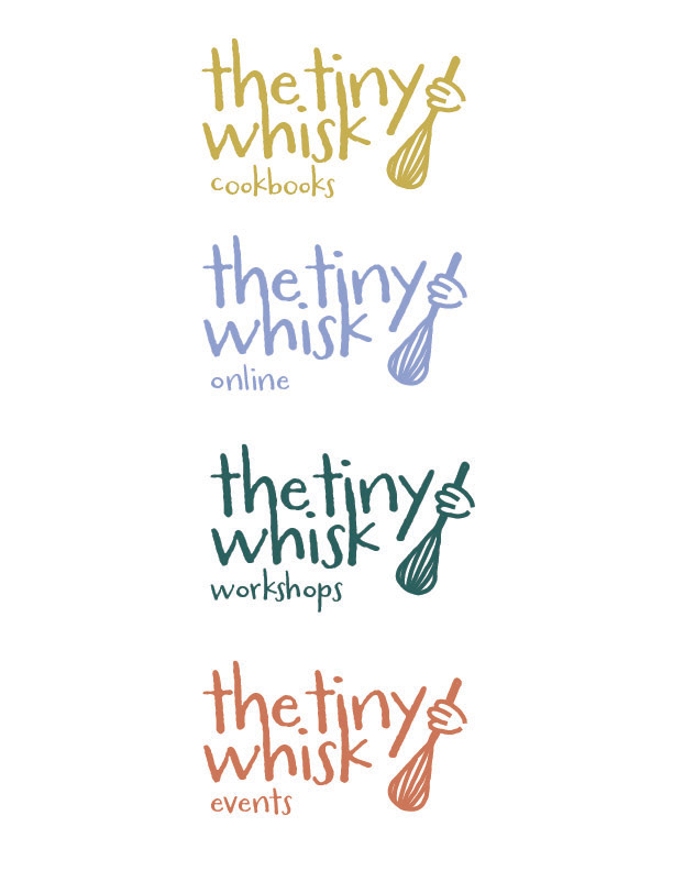
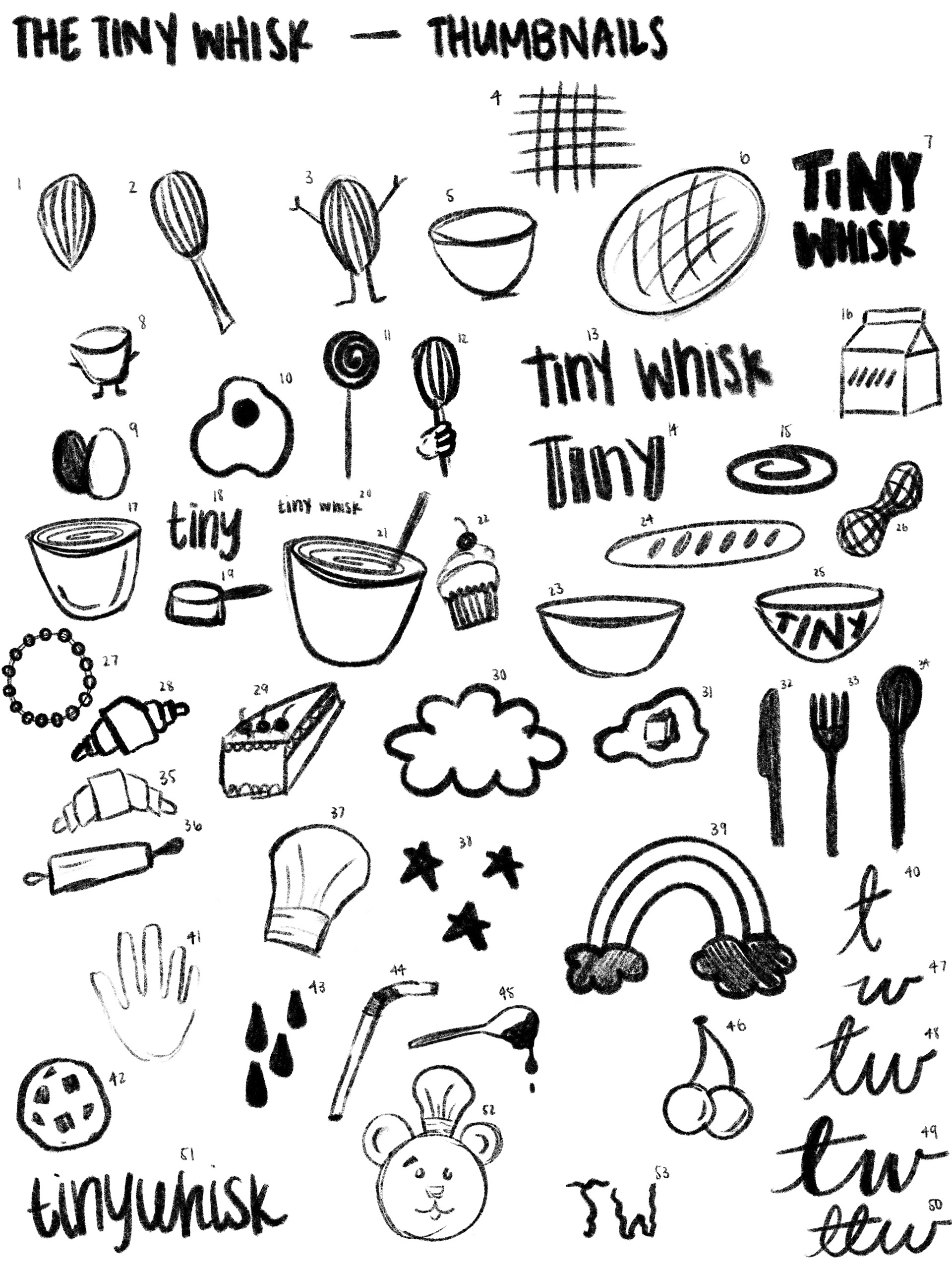
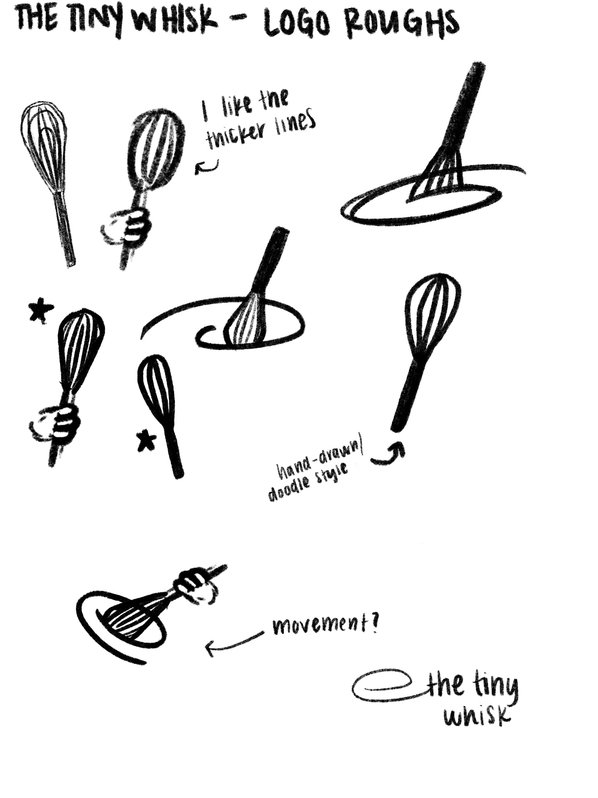
The logo is central to the brand, designed in a doodle-inspired, organic style to reflect a youthful, approachable spirit. Its hand-drawn look supports the imaginative, hands-on nature of the baking classes and resonates with both kids and parents.
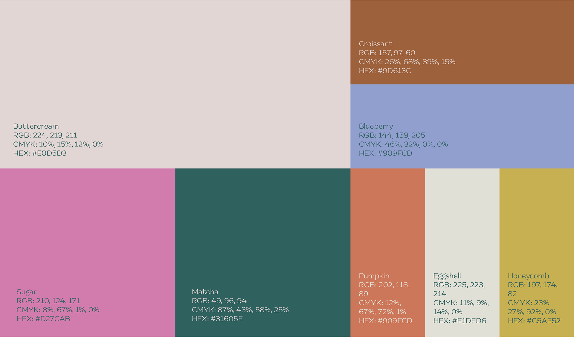
The colour palette features soft, cozy tones like Buttercream, Sugar, Honeycomb, and Matcha. These choices evoke warmth and playfulness while providing a clean foundation for brighter accents, representing the variety of baking ingredients and activities.
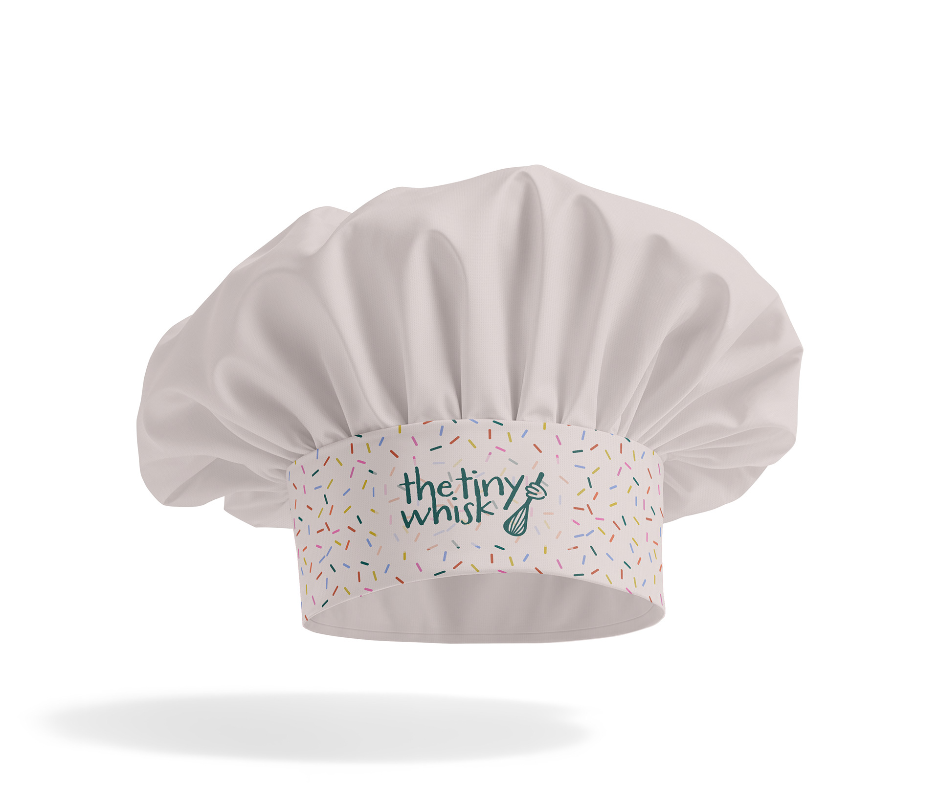
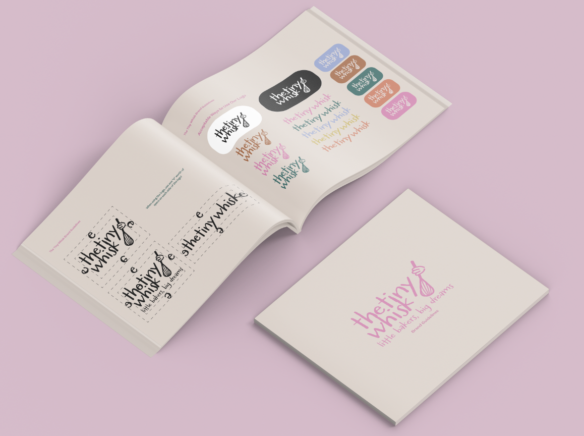
I used Adobe Illustrator to develop key brand elements and layout designs, and Photoshop to apply these visuals to mockups. The final deliverables include logo variations, colour guidelines, a stationary kit and branded take-home items like aprons and chef hats.
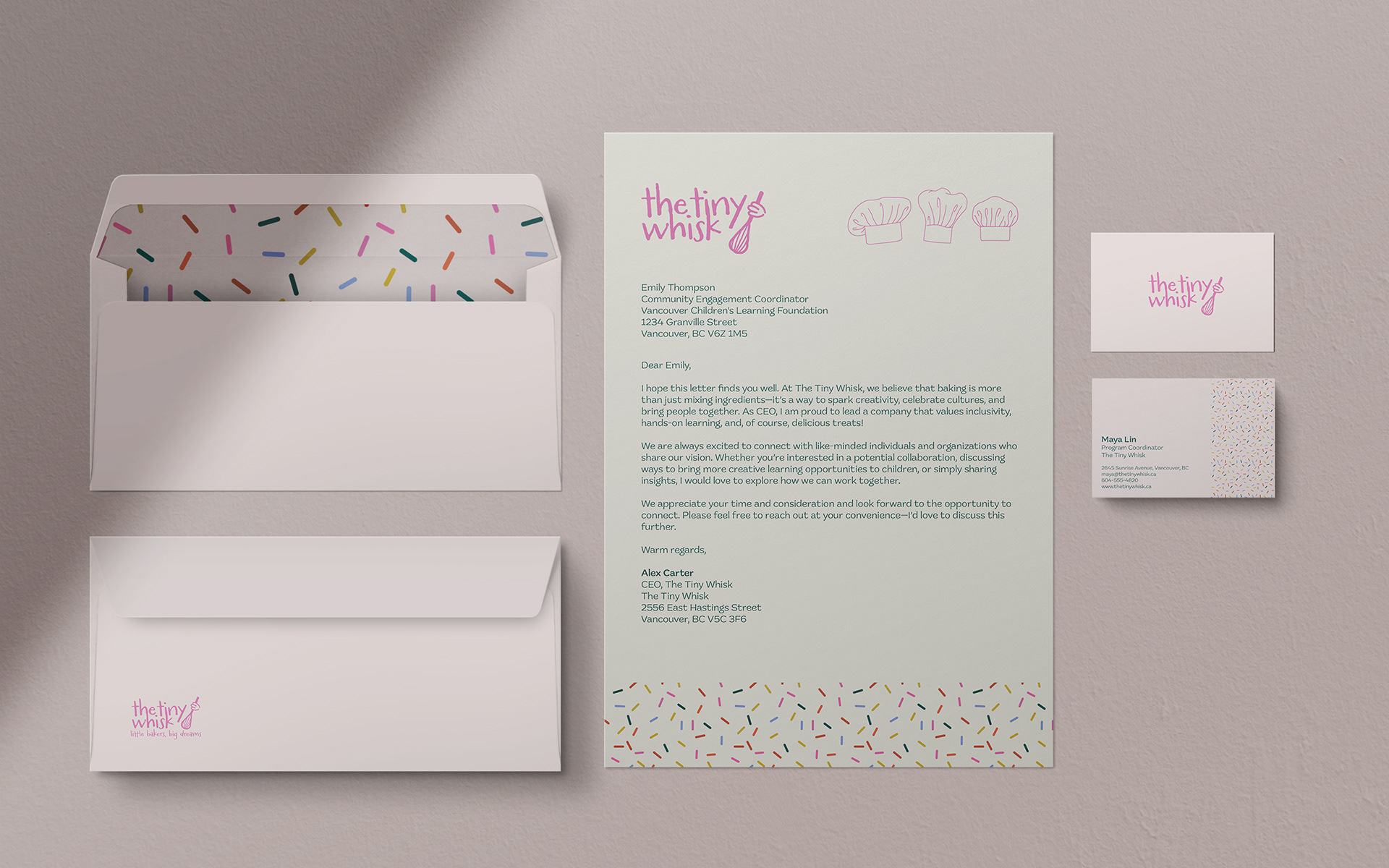
A key focus of this project was maintaining a cohesive and polished brand identity across all applications. I aimed to balance playful visuals with professional execution, ensuring the brand felt engaging for children while still earning trust from parents.